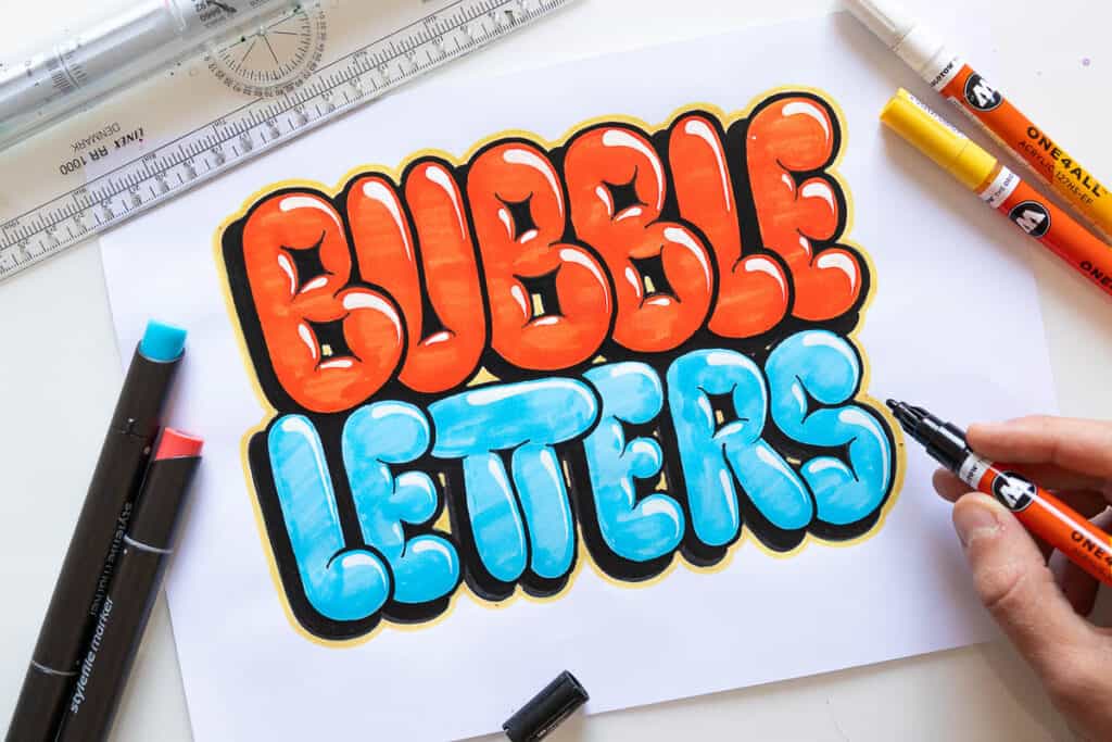
Bubble letters are fun, puffy, rounded letters—perfect for posters or doodles.
Here’s how to draw them step-by-step, with a video and free printables to get you started fast!
How to Draw Bubble Letters in 5 Easy Steps
Technically speaking you can create bubble letters in a multitude of ways.
However, I want to show you what I consider to be the easiest way to do it.
So let’s begin with an example using the letter A.
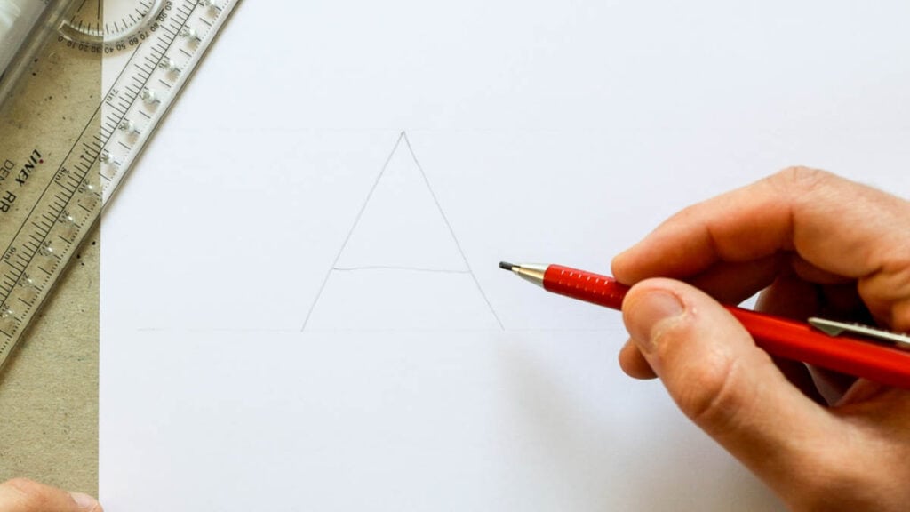
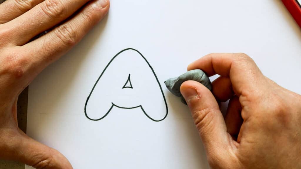
Step 1 –
Using my pencil, I’m going to write out a capital letter A in the most basic form possible.
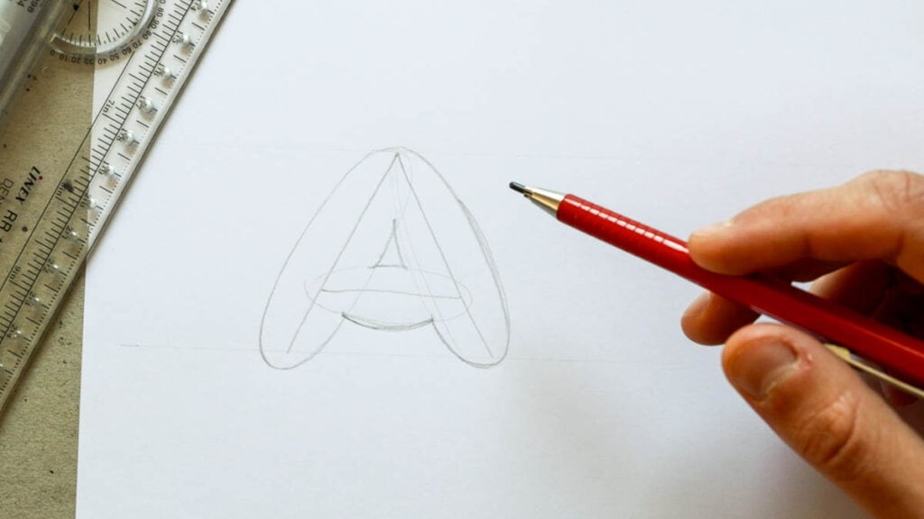
Step 2 –
Again, using my pencil, I will draw out an outline around each separate part of the letter A.
It’s super important that we divide each letter into its most basic parts as much as possible.
In this example, we have the two diagonals and the middle horizontal stroke.
As I’m outlining these parts I make sure to round the edges.
You decide how thick you want these outlines to be.
If you want a heavier-looking letter than make it thicker and vice versa.
Step 3 –
Using a fine liner, I’m going to outline the outline I made in the previous step.

Step 4 –
I’ll take my eraser and delete the pencil lines.
And there you have a bubble letter A!
I just want you to take a quick moment and notice that in some places the strokes overlap and create sharp edges.
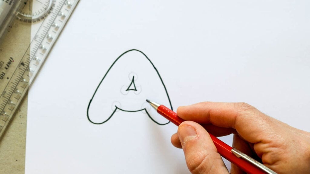
That’s perfectly fine.
In fact, having a few sharp edges inside the letter is essential to achieve that distinctive inflated, bubbly look.
You can see how it would look if we kept the edges rounded on the inside as well.
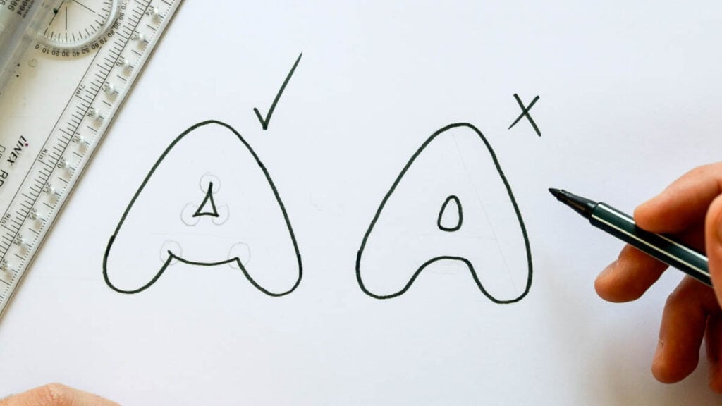
Not that it would be incorrect or wrong if you made your bubble letters like that, I just think that the example on the left looks much better.
Btw. this drawing technique is very similar to drawing block letters.
What about rounded bubble letters?
Like always, rounded letters can be a bit more tricky.
By rounded I mean letters such as O, C, S, Q, etc.
Even letters with partly rounded parts such as R, P, B, J, etc.
But don’t worry, I’ll show you now that it’s easier than you might think.
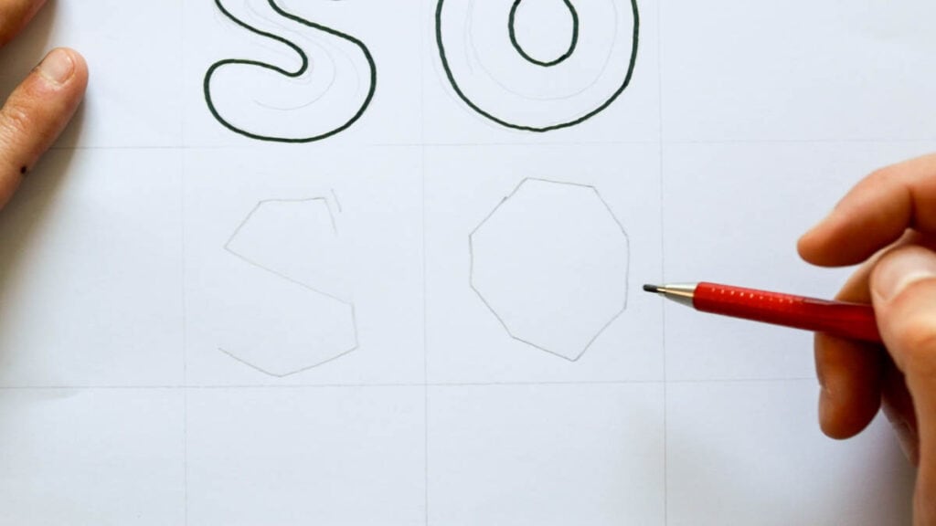
You can choose between two main techniques.
The first one follows the same idea as the one I demonstrated earlier.
So, you write the letter out and you just create a thicker outline around it.
Here is an example with the letters S and O.
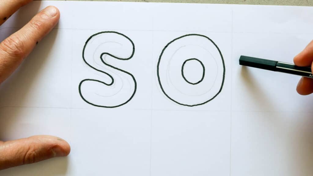
This technique is pretty simple and straightforward but I feel that with rounded letters it gives a bit of a boring result.
Here is the second technique, which is the one I prefer more.
Instead of writing out the letter in the basic shape, I will make it more square and angular.
Here is an example –
Writing the letters like this allows me to break the letter down into smaller parts.
Now I can outline those parts and keep the outer edges more rounded while the ones inside are sharper.
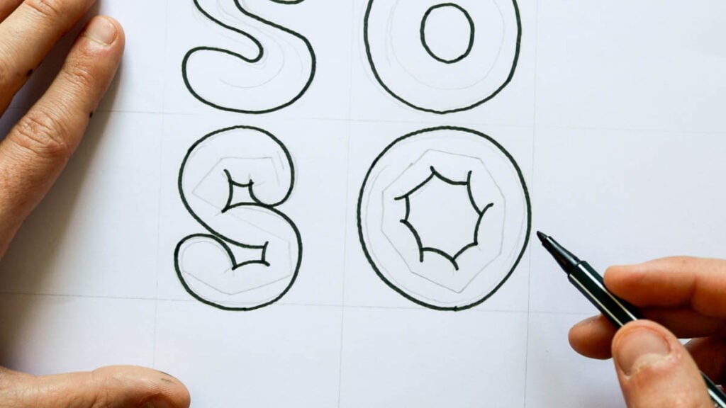
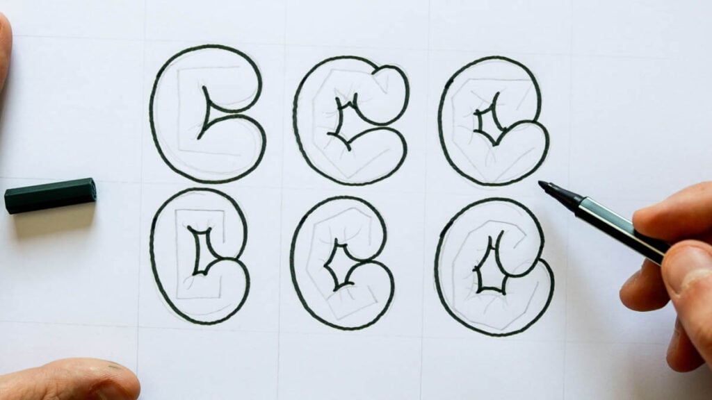
By using this technique not only able to achieve a more interesting look, but I can also create a bunch of different variations.
Since the initial skeleton letter is more angular I can shape the final look in many variations.
Check out the example below.
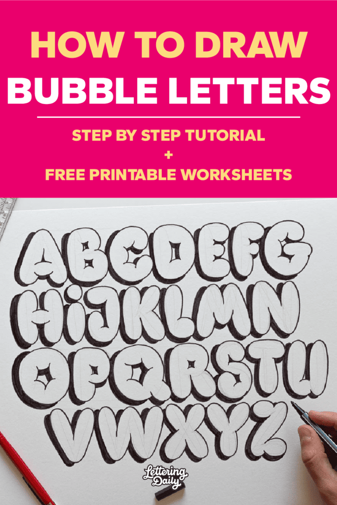
Watch It: Bubble Letters Alphabet Video
Alright, now that we’ve seen the technique needed to draw bubble letters, let’s apply it to the other letters as well and create the whole alphabet.
Here you can see the video process of me creating the whole alphabet using the same method I demonstrated previously.
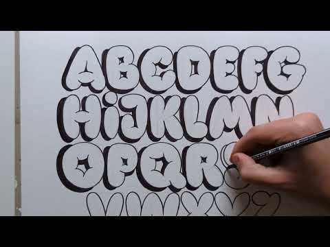
Here you can see an image of the whole bubble letter alphabet.
You can also notice that I’ve added a bit of a drop shadow to make the letters pop even more.
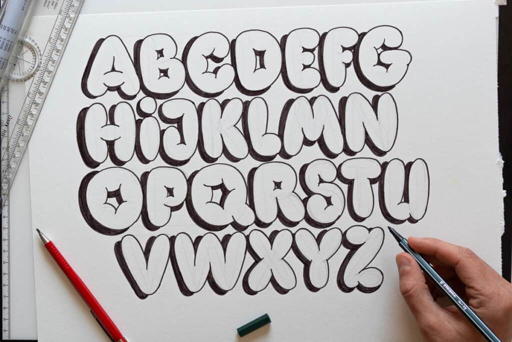
The same principle can be applied to lowercase (minuscule) letters as well.
FREE printable bubble letters worksheets
To help you practice your bubble letters, I created two free printable worksheets.
One comes with a drop shadow already in place, the other one is without so you can practice adding the drop shadow in any direction you want.
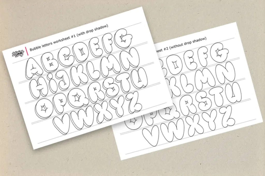
Like with all my worksheets, you can get these for free from the Lettering Crate.
If you’re still not part of the Lettering Crate, all you need to do is drop your email below, and you’ll get instant access to it.

Stay updated with my tutorials and get instant access to the Lettering Crate –
A growing library of free lettering & calligraphy resources that includes –
Tools needed to draw bubble letters
Bubble letters are a form of hand lettering so we will need pretty much the same tools.
Also, we will need a few basic tools to learn the basics of bubble letters. Let’s have a look (links to Amazon) –
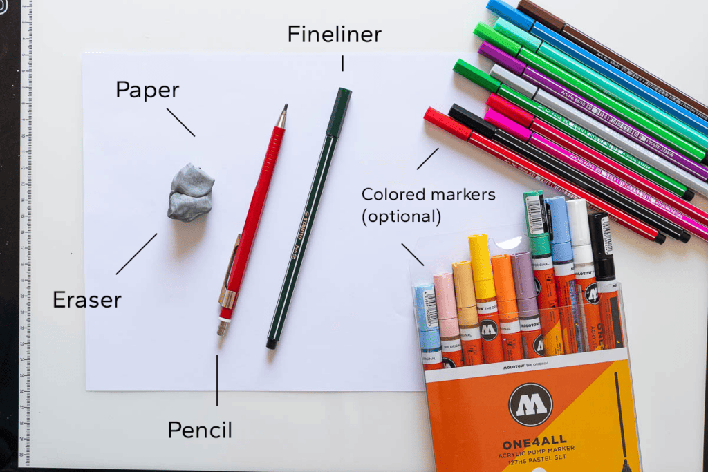
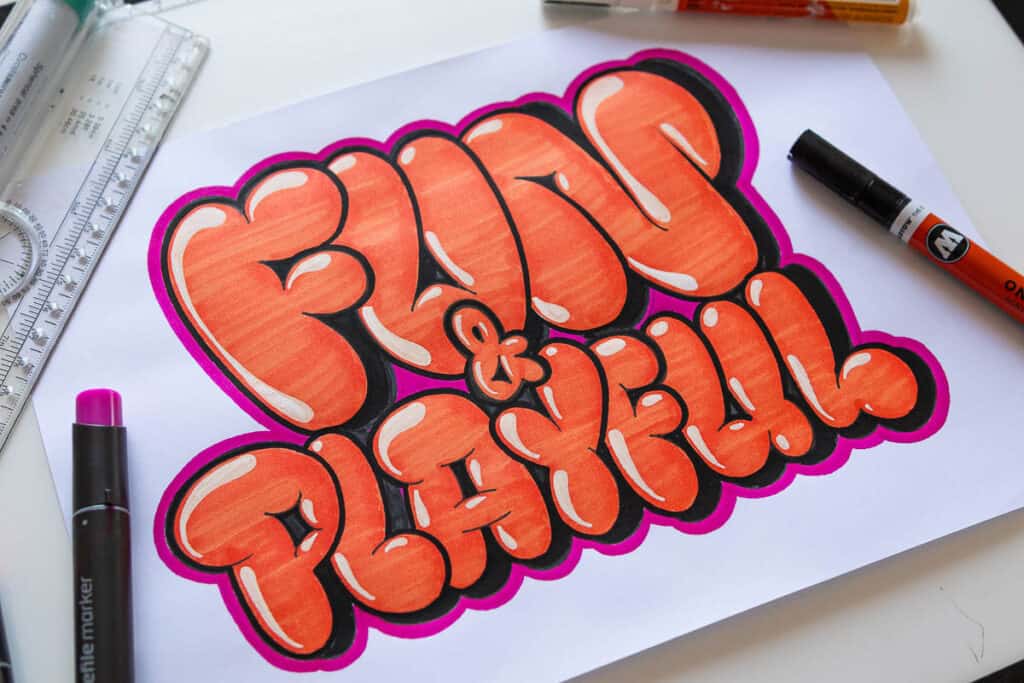
The true power of bubble letters is achieved once we add colors and various effects – which i’ll talk more about in the upcoming section.
To learn the basic construction and shading of bubble letters you just need the few basic tools I mentioned.
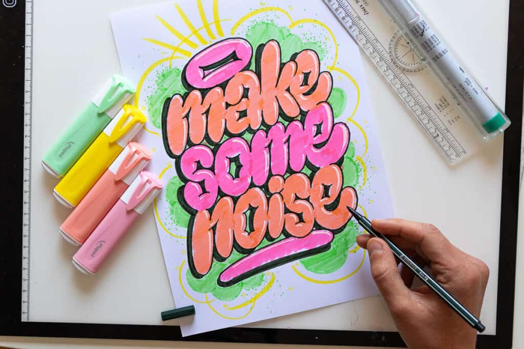
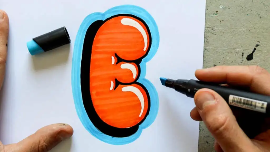
3 cool effects you can add to your bubble letters
Bubble letters are cool on their own but they are even cooler once you add a few effects to them.
The best part is that these effects are super easy to add and they can really lift the whole look of your bubble letters.

For this section, I wanted to show you three simple and cool-looking effects for your bubble letters.
Cool effect #1 – Make a drop shadow on your bubble letters
How to add shadows to your lettering is something we have already covered in a separate tutorial, but I’ll give you a quick demonstration here as well.
If you never did drop shadows before it might seem a bit daunting at first, but don’t worry it’s easier than you might think.
The first thing is to imagine a light source.
Most commonly it’s either on the top left or the top right side.
For this example, let’s imagine the light source is on the top right side.
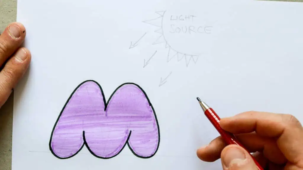
The drop shadow will be cast on the opposite side, which in this case is the bottom right.
This means that each bottom and right side of my letter will have a cast shadow. Here is an example –
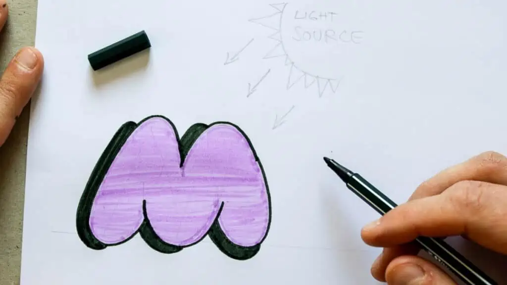
Notice that I leave a bit of space before I start (or finish) the shadow.
This gives the illusion of the letter popping off the page.
The absolute same thing can be done if we switch the light source to the other side.
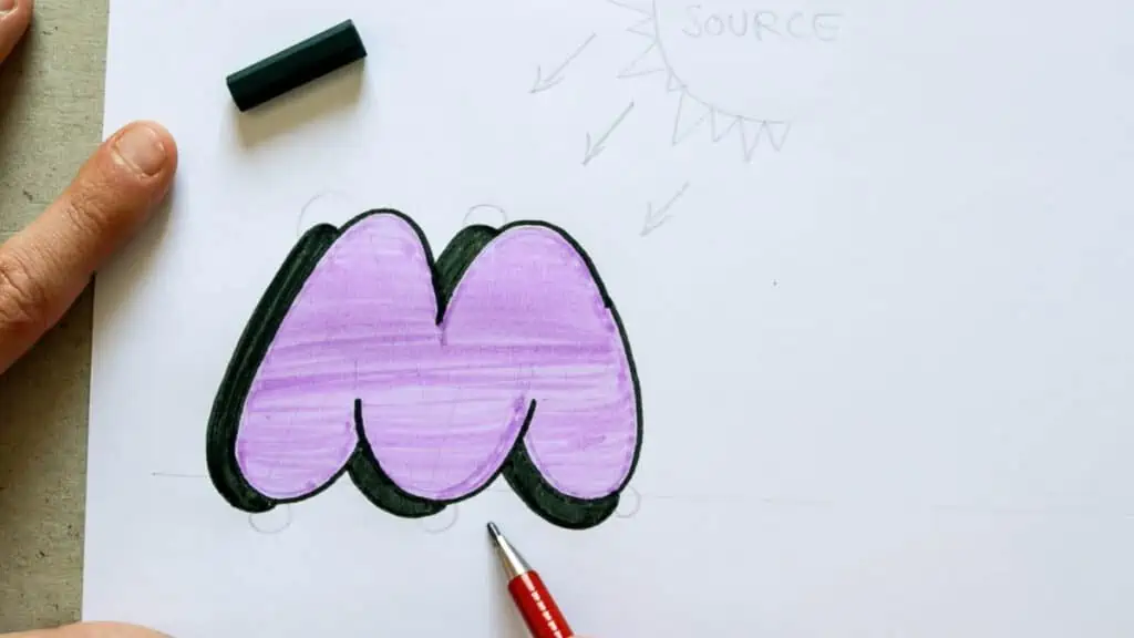
It does take a bit of practice before you get it, but trust me, if you do the whole alphabet a couple of times you’ll already learn how to do the drop shadow.
You can use the bubble letter alphabet image example as a reference for the other letters.
Technically speaking you can put your light source wherever you want on the page, but it’s most commonly placed (and it looks the best) on either the top right or top left side.
Cool effect #2 – Adding highlights to your bubble letters
The easiest way to explain what highlights are is to say that they are the exact opposite of shadows.
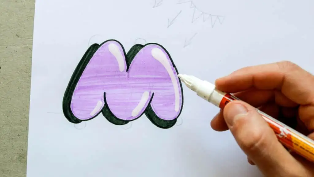
Highlights appear on the areas closest to the source of light – they are the points where the light reflects from the shape.
So if our light source is on the top left side our highlights will appear on all top and all left side of our letters.
It’s also important to mention that highlights are always best presented with white or other bright colors.
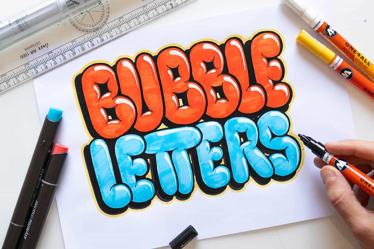
Cool effect #3 – Adding an extra outline (second line) to your bubble letters
Another cool effect to add is a second line that goes around the other edges of the whole piece.
That means both the letter and the shadow as well.
The second line really adds a special extra pop to the whole look of your bubble letters.
What matters is that you pick the right colors.
There needs to be a good amount of contrast between these lines, otherwise, it doesn’t look that good.
I wrote a whole separate article about colors and how to use them in your lettering.
Bonus effect #4 – Over inflating your bubble letters
This is a super simple and easy tip that will make your letters look more ”bubbly”.
Remember that at the beginning of the tutorial, I mentioned that the overlapping strokes will create sharp edges?
Just by adding a bit more detail to these inner edges, you can make your letter look more bloated.
Check out this example –

Easy right?
By adding various effects to your bubble letters you can achieve some really creative designs.
I love these two examples by Renee from her tutorial on 5 lettering effects anyone can do –


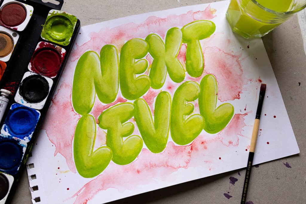
I also made a little piece using watercolors.
Haven’t worked with watercolors in a while so I’m a bit rusty.
The cool thing about watercolors is that you can layer different values and create more advanced shading.
Sum up and final words about bubble letters
Let’s do a quick sum-up of everything we covered in this tutorial –
- Bubble letters are a fun and playful lettering style
- They get their name due to the inflated and rounded shape
- You only need a few basic tools such as paper, a pencil, a fine liner, and an eraser.
- The easiest way to draw bubble letters is by separating the letters into individual parts and creating a “thick outline” around each part.
- You can add various effects and colors to make your bubble letters pop even more.
- Consistent practice is the absolute key to improving your work
And there you have it friends!
That’s how you can draw bubble letters.
Until the next time, Cheers!
Pin me!
About the author

Hey, I’m Max. I’ve been drawing and messing around with letters since 2011. I don’t have a formal art degree—my background is actually in the kitchen as a former chef and on the streets painting graffiti with my friends. Over the last decade, through a ton of trial and error, I somehow turned that obsession into a full-time gig. These days, I design custom logotypes for global brands and paint large-scale murals. I started Lettering Daily just to create the kind of honest, no-BS tutorials I wish I’d had when I was starting out. Stick around, and let’s draw some letters.

Thank you for sharing your passion, thank you for your generous heart, few people give of what they have in such a big way as you do.
Why 😩
Why 😩
Why 😩
Why are u so kind
You are soooo bad at art
The first thing I thought of this writing was that it was bad
i love youre buble riting i was doing the a and it terned out perfect .
Awesome! Glad to hear that 🙂 Im planning a bit update of this article, and I’ll make it even better.
Your bad at writing
This really helped me with a gift for my friend
Awesome! Glad to hear that 🙂
This is a great website! love it! I’m gonna recommend it to my friends in the art class!
🤩🤩🤩
Thank you, Cece! 🙂
This is a really good website to teach people how to do bubble letters! In my honest opinion, this is starting to be my favorite website!
Thank you so much! 🙂
Ok
bro
Wassup bro?
You have brought up a very great points , thanks for the post.
You are welcome! 🙂
you are so cool and helpful!!
Thank you so much! 🙂
I agree with you
can you do the letter y
Will do, yes! I’ll do a whole update of this article very soon! 🙂
it is really help full and you need to use it for everything cuz i do
Thank you, Esperanza! 🙂
This was very helpful. Thank you
Thank you so much, Antonella! 🙂 It really means a lot!
yes tank you people to be the god hahahahaha
Thank you,,, You forgot Q LOL
Yup, I did 😀 I will fix that in the next update, don’t worry 🙂
I pinned you because you are good
Thank you! 🙂
could make a worksheet or freebie for bubble letters that would really help! btw keep up the great work!
You are right! I will update the article as soon as I can. Better and more detailed instructions, a better video and most definitely a worksheet!
Thank you for the feedback! Hearing what my readers want to see is really helpful! Cheers 🙂
Hey, do you still have your whole alphabet video up?
Yup, it’s always here. You can’t see it or?
YOU are an amazing website i draw my name and i was awesome best site ever https://www.lettering-daily.com/
thanks-
faridaalwazeer
This is very helpful. thanks for always being an inspiration to us. Especially to me as a newbie.
You are welcome, Melissa! 🙂
I made the tutorial and I enjoyed every moment. Thanks a lot!! Greetings from Mexico, keep the good work!
Thank you so much for the kind words!
Wow, you’re amazing, thanks for your great tutorial, and God bless you.
Thank you so much for the kind words, means a lot! 🙂
How do you do the letter “Q”?
Hey Patricia! At the beginning of the article, there is a video where i demonstrate how to draw the whole alphabet (along with the letter Q). Basically, it’s just like the letter O with a bar extending in the bottom right corner. Feel free to join our official Facebook group – over there I can give you some direct feedback to your work 🙂
Really learned a lot from this tutorial, than you for taking the time to teach a new technique. Thank you!
Thank you so much for your kind words! Really means a lot 🙂