Z might be the final letter of the alphabet, but creatively, it’s far from the end. From flamboyant flourishes to experimental abstractions, Z offers a wide range of stylistic opportunities. Whether you treat it like a swoosh, a zigzag, or a sculptural stroke, this final form is your chance to go bold, go strange, or go elegant—just don’t go quiet.
🎁 Free Lettering Worksheet Download!
Get one full tracing page straight from the Style Your Alphabet Workbook — absolutely free.
Practice, trace, and start styling your letters today!

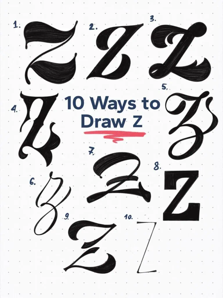
🔤 10 Ways to Draw the Letter Z – Style Descriptions
1. High-Contrast Curved Serif
This Z bends the rules—literally. Instead of a rigid zigzag, the strokes flow with exaggerated curves and teardrop terminals. It’s sculptural, stylish, and still unmistakably a Z.
2. Stylized Transitional Display
A reinterpretation of the classical serif Z with compressed proportions, bracketed contrast, and a sharp diagonal. The tilt adds motion, while the details hint at tradition.
3. Playful Thorn Swash
This bold Z swirls upward and downward, looping into thorn-like extensions that feel almost botanical. Equal parts whimsical and wild.
4. Heavy Vintage-Inspired
Chunky strokes, decorative touches, and retro flair. This Z channels old-school signage and type specimens, with just enough restraint to remain clear and legible.
5. Flourished Calligraphic Form
A high-contrast Z with curling terminals at both ends—part uppercase, part lowercase. It flows like ink across paper, perfect for a dramatic signature mark.
6. Upright Copperplate-Inspired Script
This refined lowercase-style Z draws from pointed-pen calligraphy. Fluid loops and a consistent slant give it rhythm and polish.
7. Wide Brush Swash Z
Painted with attitude. The sweeping brush-like strokes curve confidently outward, making this Z feel theatrical and full of momentum.
8. Geometric Display Block
All hard angles and even stroke weight, this one is built from pure structure. Feels bold, modern, and unapologetically rigid.
9. High-Contrast Abstract Swash
A sliced and mirrored construction that breaks the Z into two tapering shapes. The thick diagonal in the center keeps it grounded in legibility—barely.
10. Hairline Minimalist Roman-Inspired
A wispy, pared-back Z that hints at classical Roman roots but strips them to the bone. The result is airy, refined, and fashion-forward.
Explore the full Hand Lettering Style Database →

Master Every Letter A–Z With 260 Creative Styles
The Style Your Alphabet Workbook is your hands-on guide to building confidence, creativity, and control in your lettering.
Inside, you’ll find:
✅ 260 hand-drawn letters to trace and remix
✅ 26 word examples to practice real-world design
✅ Beginner-friendly insights that teach you how to think like a lettering artist
About the author

Hey, I’m Max. I’ve been drawing and messing around with letters since 2011. I don’t have a formal art degree—my background is actually in the kitchen as a former chef and on the streets painting graffiti with my friends. Over the last decade, through a ton of trial and error, I somehow turned that obsession into a full-time gig. These days, I design custom logotypes for global brands and paint large-scale murals. I started Lettering Daily just to create the kind of honest, no-BS tutorials I wish I’d had when I was starting out. Stick around, and let’s draw some letters.
