The letter A is a natural attention-getter. As the first in the alphabet, it’s often the first letter people learn to draw—and it shows up everywhere. Structurally, it’s made for variety: you’ve got that strong diagonal energy, a clear counter space, and plenty of room to experiment with crossbars, terminals, and swashes.
Whether you go serif, sans, script, or full-on ornamental, the letter A always stands tall—and gives you a solid base to push your style in whatever direction you want.
🎁 Free Lettering Worksheet Download!
Get one full tracing page straight from the Style Your Alphabet Workbook — absolutely free.
Practice, trace, and start styling your letters today!

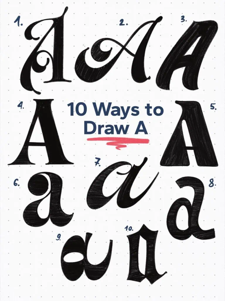
🔤 10 Ways to Draw the Letter A – Style Descriptions
1. Flourished Deco
Ornamental and expressive. This one’s all about flair—like a vintage marquee. Most of the action happens on the left side, which is perfect when A’s kicking off a word and you want that bam right from the start.
2. Script Swash
Dramatic, smooth, and curvy. Think of it like a signature with attitude. That contrast between thick and thin strokes gives it this beautiful rhythm—like it’s dancing a little.
3. Brush Casual
Sign painter energy all the way. Bold, relaxed, and a little gritty. Every stroke is trying to say, “I did this in one shot,” whether or not you actually did.
4. Old Style Serif A
Classic with a twist. Medium contrast, bracketed serifs, nothing too flashy—but still solid and grounded. If fonts had jobs, this one would be a book designer.
5. Modern Bold Sans Hybrid
Bold strokes, tilted axis, and a random little serif on top? Yeah—it’s kind of a mutt, but that’s what makes it cool. A weird blend of old-school and modern that just works.
6. Old Style with Dot Terminal
Two-story lowercase “a” with a beefy ball terminal—like it’s trying to say, “I may be fancy, but I’ve got personality.” A funky yet serious vibe that actually balances out.
7. Spencerian/Funky Script
Honestly? I was listening to James Brown and looking at Spencerian references—and this is what came out. It’s got that elegant curve but still wants to party.
8. Marker-Style Sans
Picture grabbing a broad-edge marker and banging out an “a” in two strokes. That’s the vibe. Slight contrast for style points.
9. Inverted Script
Just flipped the usual weight logic and leaned into the weirdness. It messes with your expectations—and that’s exactly why I like it.
10. High & Condensed Blackletter
Tight counters, high x-height, and straight-up attitude. Definitely rooted in blackletter but compressed into something sharper and more aggressive. A little goth, a little editorial.
Explore the full Hand Lettering Style Database →

Master Every Letter A–Z With 260 Creative Styles
The Style Your Alphabet Workbook is your hands-on guide to building confidence, creativity, and control in your lettering.
Inside, you’ll find:
✅ 260 hand-drawn letters to trace and remix
✅ 26 word examples to practice real-world design
✅ Beginner-friendly insights that teach you how to think like a lettering artist
About the author

Hey, I’m Max. I’ve been drawing and messing around with letters since 2011. I don’t have a formal art degree—my background is actually in the kitchen as a former chef and on the streets painting graffiti with my friends. Over the last decade, through a ton of trial and error, I somehow turned that obsession into a full-time gig. These days, I design custom logotypes for global brands and paint large-scale murals. I started Lettering Daily just to create the kind of honest, no-BS tutorials I wish I’d had when I was starting out. Stick around, and let’s draw some letters.
