The letter Y is one of the most versatile in the alphabet—it splits, it curves, it descends. That forked structure opens up room for both symmetry and disruption. From brushy descenders to barbed serifs, this batch explores how a single letter can feel refined, rebellious, or downright playful depending on how it lands.
🎁 Free Lettering Worksheet Download!
Get one full tracing page straight from the Style Your Alphabet Workbook — absolutely free.
Practice, trace, and start styling your letters today!

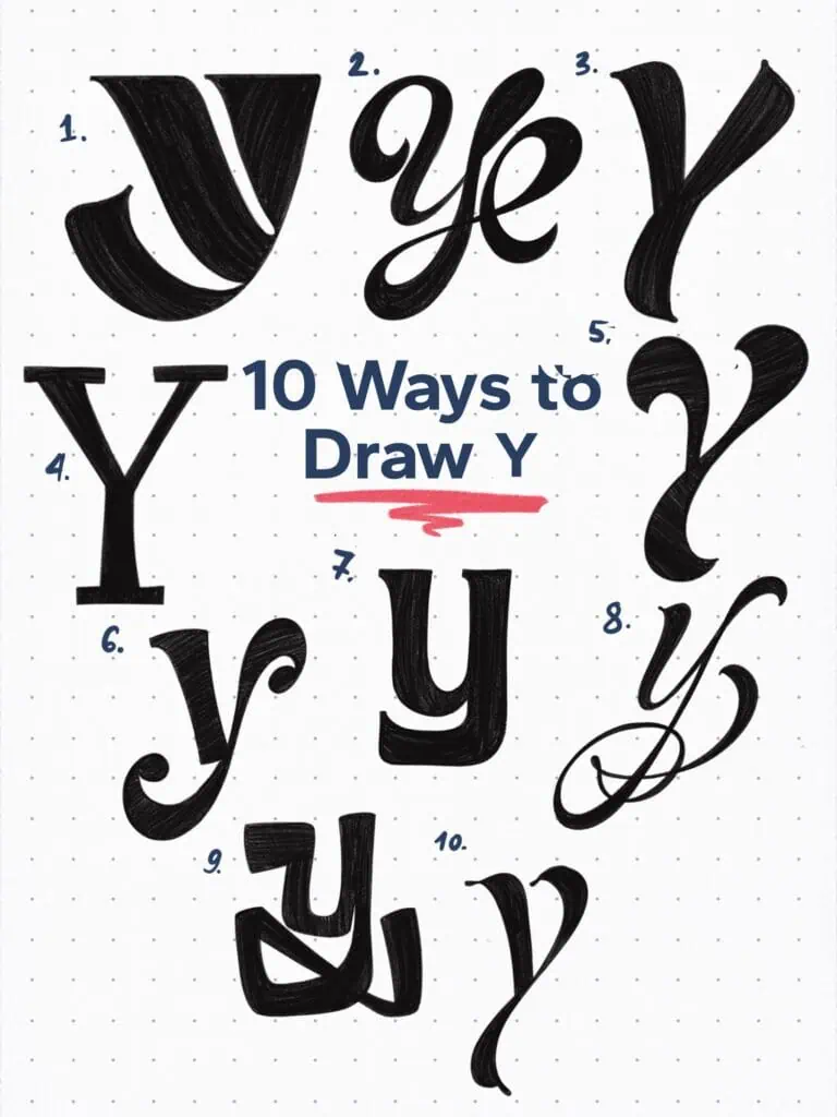
🔤 10 Ways to Draw the Letter Y – Style Descriptions
1. High-Contrast Geometric Abstract
This bold lowercase Y reduces the form to essential parts—dramatic weight contrast and simplified construction. A stylized, almost architectural approach that leans heavily on negative space for definition.
2. High-Contrast Flourished Script
Elegant and dynamic, this Y flows with confident movement. Its exaggerated loops and delicate tapering give it the energy of formal pointed pen calligraphy without fully adhering to copperplate rules.
3. Casual Sign Painter’s Capital
Bold and upright with brush-like terminals and a slightly reversed stress. This capital Y is inspired by mid-century hand-painted signage—expressive yet structured.
4. Squared Serif with No Bracketing
This Y features sharp, unbracketed serifs and strong vertical tension. The squared-off structure creates a feeling of assertiveness while keeping a balanced classical footprint.
5. Swashed Display Y
This dramatic capital Y pushes the form to its decorative limits. With flaring terminals and a wide, sweeping tail, it’s meant to dazzle in a wordmark or drop cap setting.
6. Ball-Terminal Script Y
A friendly lowercase Y with soft curves and exaggerated ball terminals on both the descending stroke and the shoulder. It strikes a balance between playful and polished.
7. Low-Contrast Ionic Serif
Sturdy and readable with subtly flared terminals. This Y is rooted in classical type traditions—simple, grounded, and dependable.
8. Copperplate-Inspired Script
Lightweight and elegant with delicate curves. This form lifts from copperplate principles but introduces more fluid, personal flair in the exit stroke and balance.
9. Blocky Interlock Script
Bold and heavy with overlapping internal curves. This Y plays with optical tension—strokes connect and bounce, giving it a constructed rhythm.
10. Playful swashed out Y
Leaning to the right, this serif Y twists traditional proportions. The tail whips outward into a gentle flourish, while the arms curve into the stem with a soft, friendly tone.
Explore the full Hand Lettering Style Database →

Master Every Letter A–Z With 260 Creative Styles
The Style Your Alphabet Workbook is your hands-on guide to building confidence, creativity, and control in your lettering.
Inside, you’ll find:
✅ 260 hand-drawn letters to trace and remix
✅ 26 word examples to practice real-world design
✅ Beginner-friendly insights that teach you how to think like a lettering artist
About the author

Hey, I’m Max. I’ve been drawing and messing around with letters since 2011. I don’t have a formal art degree—my background is actually in the kitchen as a former chef and on the streets painting graffiti with my friends. Over the last decade, through a ton of trial and error, I somehow turned that obsession into a full-time gig. These days, I design custom logotypes for global brands and paint large-scale murals. I started Lettering Daily just to create the kind of honest, no-BS tutorials I wish I’d had when I was starting out. Stick around, and let’s draw some letters.
