V is one of the most naturally dynamic letters in the alphabet—its diagonal stance practically begs for movement, tension, and drama. From sharp serifs to fluid loops, these ten variations explore how versatile this single shape can be in both uppercase and lowercase form.
🎁 Free Lettering Worksheet Download!
Get one full tracing page straight from the Style Your Alphabet Workbook — absolutely free.
Practice, trace, and start styling your letters today!

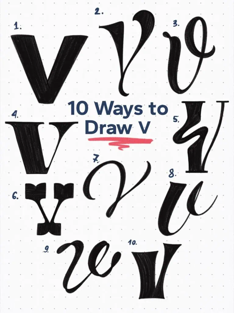
🔤 10 Ways to Draw the Letter V – Style Descriptions
1. Gothic Sans Serif
A no-nonsense, bold V with clean angles and solid structure. Its minimal design offers clarity and strength—ideal as a foundation or for modern, utilitarian layouts.
2. Elegant Swash Serif Hybrid
A squared serif base pairs with a subtle, elegant swash. This form strikes a balance between classic and contemporary—refined but not overly decorative.
3. Looped Brush Script
This lowercase V flows with ease, featuring an exaggerated ascender that loops smoothly. It introduces rhythm and personality—perfect for connected script lettering.
4. Wedge Serif Editorial
Tall, sharp, and dramatic. This V contrasts thin apexes with thick feet, giving it an editorial edge suitable for fashion-forward headlines or luxury layouts.
5. Liquid Diagonal Modern Serif
A dynamic twist on a classic shape. The joint between the arms is replaced by a flowing, liquid-like curve that adds unexpected softness and motion.
6. Inverted Tuscan Slab Serif
Bold and blocky with outward-flaring terminals—like butterfly wings. A playful inversion of tradition that channels vintage posters and circus typography.
7. Flourished Modern Script
Graceful and sweeping, this hand-lettered style features an extended entry stroke that flows into the letter’s core. Elegant, airy, and romantic.
8. Bold Brushstroke Script
Built with thick, painterly strokes and a tight exit loop, this lowercase V feels bold and expressive—ideal for energetic lettering or signage.
9. Playful Ribbon Loop
At first glance it looks chaotic, but on closer inspection reveals a clever looped construction that mimics curling ribbon. Fun, experimental, and expressive.
10. High-Tapered Serif V
This design emphasizes verticality and sharpness, tapering to fine points at both ends. It carries an edge of rigidity—great for commanding layouts or bold wordmarks.
Explore the full Hand Lettering Style Database →

Master Every Letter A–Z With 260 Creative Styles
The Style Your Alphabet Workbook is your hands-on guide to building confidence, creativity, and control in your lettering.
Inside, you’ll find:
✅ 260 hand-drawn letters to trace and remix
✅ 26 word examples to practice real-world design
✅ Beginner-friendly insights that teach you how to think like a lettering artist
About the author

Hey, I’m Max. I’ve been drawing and messing around with letters since 2011. I don’t have a formal art degree—my background is actually in the kitchen as a former chef and on the streets painting graffiti with my friends. Over the last decade, through a ton of trial and error, I somehow turned that obsession into a full-time gig. These days, I design custom logotypes for global brands and paint large-scale murals. I started Lettering Daily just to create the kind of honest, no-BS tutorials I wish I’d had when I was starting out. Stick around, and let’s draw some letters.
