The letter U is all about flow, gravity, and anchoring curves. Its horseshoe-like shape creates a natural container for contrast, swashes, and structural experimentation. Whether you’re working in serif, sans, script, or something more expressive, U is one of those letters that can bend softly or stand tall—offering an incredible range of stylistic freedom.
🎁 Free Lettering Worksheet Download!
Get one full tracing page straight from the Style Your Alphabet Workbook — absolutely free.
Practice, trace, and start styling your letters today!

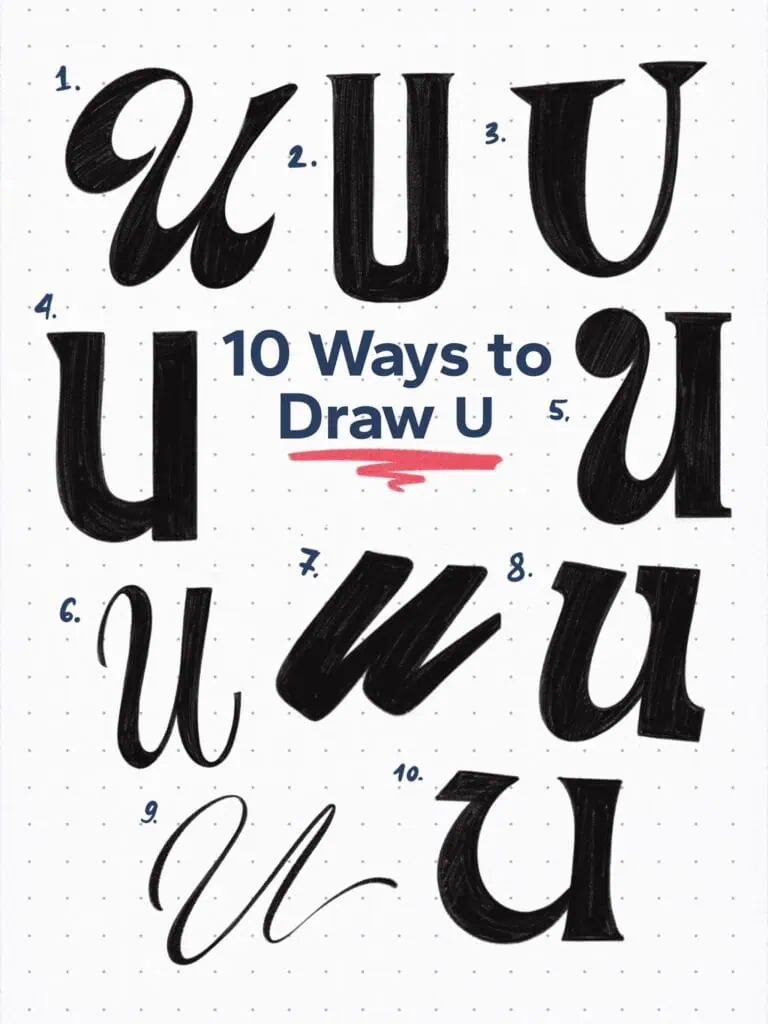
🔤 10 Ways to Draw the Letter U – Style Descriptions
1. High-Contrast Brush Script
A flowing lowercase U with thick downstrokes and sharp tapering. The entry stroke curls inward, adding a sense of rhythm and flair.
2. Bold Display Spur Serif
This uppercase U features vertical stems with soft interior curves as well as spur serifs that give it a sturdy presence.
3. Latin Serif
Latin serif styles are always so fun and playful. They do retain somewhat of their structure but they bend the rules as much as they can.
4. Rounded Grotesque
Minimal and geometric, this U sits low and wide with monoline weight. Feels grounded and dependable.
5. Loop-Terminal Script
A playful lowercase form with a bubble terminal at the top left. Balanced proportions give it a friendly, informal tone.
6. Upright Ad Roman Italic
A classical letter style that features moderate stroke contrast along with entry and exit lines for smooth readability and elegance.
7. Blocky Sign Painter’s Script
Thick and slightly slanted, this U is built like a brick. The angled base and exaggerated width give it a sense of momentum. Inspired by the boldness of a heavy sign painter’s brush.
8. Playful Ionic
Here I played a bit with the features of the U. I tilted the entire letter—and even more so the left stem—inward. It’s all about experimenting and having fun. The classical slab-like ionic serifs ground the form.
9. Signature Loop Script
Elegant and flowing with a long, confident exit stroke. The form is lifted and open, perfect for logotypes or expressive branding.
10. Uncial Inspired
Not entirely following the uncial U, but the inspiration is clear. A large rounded bowl on the right side, anchored with a contrasting straight vertical stem.
Explore the full Hand Lettering Style Database →

Master Every Letter A–Z With 260 Creative Styles
The Style Your Alphabet Workbook is your hands-on guide to building confidence, creativity, and control in your lettering.
Inside, you’ll find:
✅ 260 hand-drawn letters to trace and remix
✅ 26 word examples to practice real-world design
✅ Beginner-friendly insights that teach you how to think like a lettering artist
About the author

Hey, I’m Max. I’ve been drawing and messing around with letters since 2011. I don’t have a formal art degree—my background is actually in the kitchen as a former chef and on the streets painting graffiti with my friends. Over the last decade, through a ton of trial and error, I somehow turned that obsession into a full-time gig. These days, I design custom logotypes for global brands and paint large-scale murals. I started Lettering Daily just to create the kind of honest, no-BS tutorials I wish I’d had when I was starting out. Stick around, and let’s draw some letters.
