The letter T may seem simple, but it’s a goldmine for stylistic exploration. From traditional Roman capitals to modern scripts and wild flourishes, the crossbar and vertical stroke give you endless opportunities to experiment. Whether you’re drawing a tall, stoic serif or a dancing script T, this is a letter that can balance structure with flair effortlessly. Let’s explore 10 unique variations and see just how expressive this one-stroke powerhouse can be.
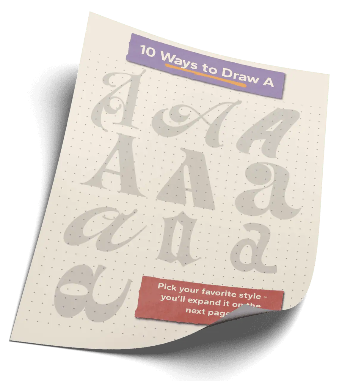
🎁 Free Lettering Worksheet Download!
Get one full tracing page straight from the Style Your Alphabet Workbook — absolutely free.
Practice, trace, and start styling your letters today!

🔤 10 Ways to Draw the Letter T – Style Descriptions
1. Fat Faced T
What makes fat-faced letterforms recognizable is the stark contrast between their thick verticals and razor-thin horizontals. This one commands attention—perfect for bold, high-impact headlines.
2. Decorative Swash Serif
This version blends elegance and drama. The extended top arm swells into a theatrical flourish, giving it a strong editorial presence without losing structure.
3. Rounded Edge Sans
Soft corners, simple construction. This lowercase T may be minimal, but when repeated or combined in a wordmark, its friendliness really comes through.
4. Italic Marker Stroke
This form channels fast, expressive lettering. Built with angled pressure variation, it has an energetic stance and a brush-pen aesthetic.
5. Hairline Modern Calligraphy
Delicate and monoline. The airy counter space, lifted crossbar, and curved strokes give this style a rhythm ideal for elegant logotypes or signatures.
6. Flared Split Serif
Mirrored curls at the top and bottom transform this serif T into something ornamental and historical. It’s part circus, part 19th-century poster art.
7. Chunky Ball Terminal
Bold and playful. The exaggerated ball terminals wrap into the stroke, making this feel sculptural and full of personality—almost cartoonish, but still intentional.
8. Cross-Bar Dominant Display
The crossbar is the star here. Thick and heavy, it nearly overtakes the stem and flips the letter’s hierarchy—great for experimental or geometric design systems.
9. Cursive Monoline Connector
Smooth and seamless. This flowing T is built to connect to surrounding letters in a continuous script, with just enough personality in its entry stroke.
10. Brush Script with Swash Exit
Expressive and dynamic. The bold downstroke is grounded, while the upward sweeping exit stroke adds flourish—ideal as the final letter in a brush-lettered word.
Explore the full Hand Lettering Style Database →

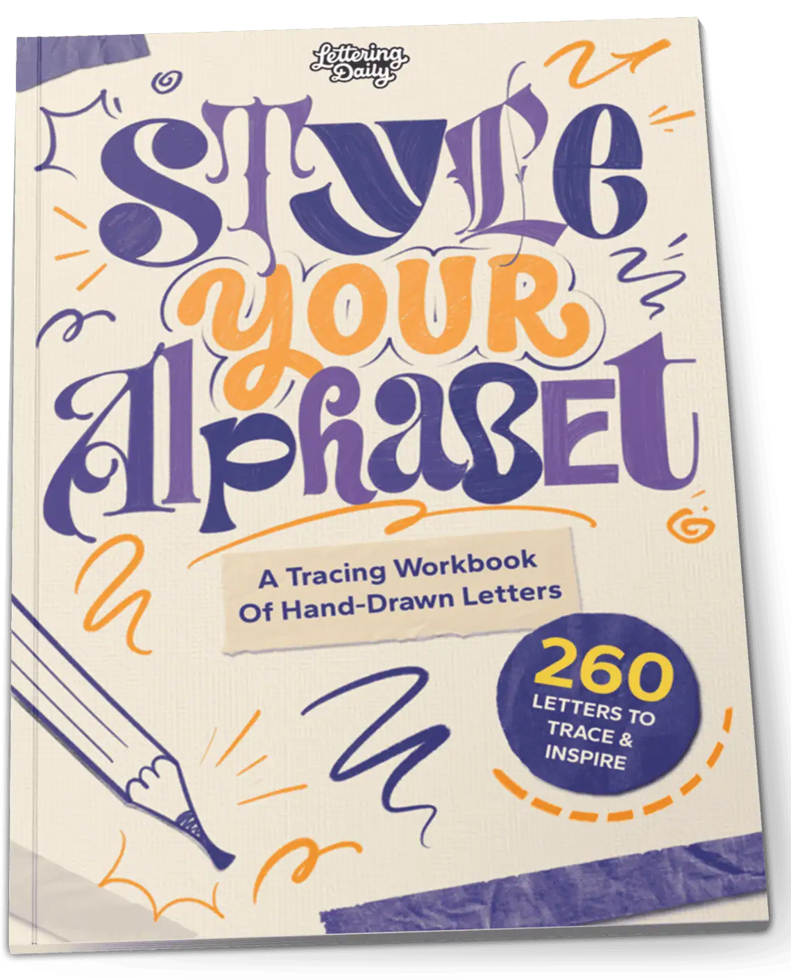
Master Every Letter A–Z With 260 Creative Styles
The Style Your Alphabet Workbook is your hands-on guide to building confidence, creativity, and control in your lettering.
Inside, you’ll find:
✅ 260 hand-drawn letters to trace and remix
✅ 26 word examples to practice real-world design
✅ Beginner-friendly insights that teach you how to think like a lettering artist
About the author

Hey, I’m Max Juric, and I’m deeply passionate about calligraphy and hand lettering.
I’ve spent years honing my skills in the art of lettering, working with hundreds of clients from all over the world on design projects such as logotypes, branding, custom lettering, murals, and more.
But my journey doesn’t end there. I’ve also dedicated myself to sharing my knowledge and expertise with others, creating a wealth of resources including tutorials, articles, and podcasts.
It’s been incredibly rewarding to see thousands of people engaging with my content each month. Knowing that I’m helping fellow enthusiasts grow and develop their skills makes me really happy.
Welcome to Lettering Daily, your hub for all things lettering and calligraphy. Whether you’re a seasoned pro or just starting out, I’m here to inspire and guide you on your lettering journey. Stick around, and let’s explore the world of letters together!

