The letter S is one of the most dynamic forms in the alphabet—it’s all curves and balance. Because of its serpentine shape, it can be stretched, swashed, compressed, or even split apart while still remaining recognizable. Whether you’re pulling from blackletter tradition or expressive brush calligraphy, the S offers endless opportunities for experimentation in stroke contrast, proportion, and rhythm. Let’s explore ten distinct styles that show off its versatility.
🎁 Free Lettering Worksheet Download!
Get one full tracing page straight from the Style Your Alphabet Workbook — absolutely free.
Practice, trace, and start styling your letters today!

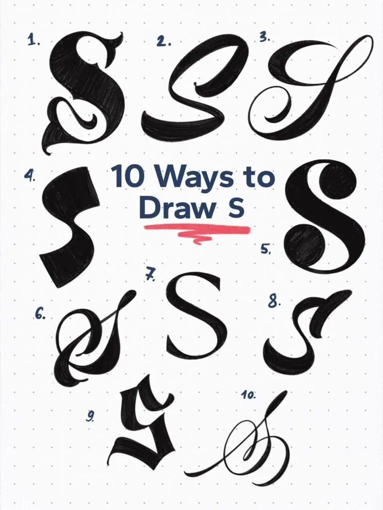
🔤 10 Ways to Draw the Letter S – Style Descriptions
1. Baroque-Inspired Tuscan Serif
This S is dramatic and indulgent. It features high contrast, mid spurs, and Tuscan serifs that also loop into a smaller-sized elegant swash.
2. Bold High-Slant Script
Rounded and energetic. This one’s made from two sweeping strokes with exaggerated slant. Its structure feels soft but confident.
3. High-Contrast Flourish
A classic copperplate approach exaggerated for impact. The stroke weight shifts dramatically, and the descending loop adds elegance.
4. Abstract Display Form
Here the idea of the S is stripped to its essence—an angular flow from top to bottom. Great for logo marks or experimental layouts.
5. Ball Terminal Serif
A transitional-style serif with ball terminals both top and bottom. A key element for the letter S is to make the upper counter space smaller than the bottom.
6. Interlocked Calligraphic Form
This S loops and crosses over itself like a monogram or ampersand. It’s flourished but still readable—ideal for high-end logos.
7. Grotesque Inspired
A clean, minimal S with low contrast and simple curves. A modern, utilitarian look that works well in tight typesetting.
8. Brushstroke Emphasis
Notice the flared terminals and irregular curve weight—this one feels like it was painted fast and confidently.
9. Blackletter Fraktur
Sharp angles, deep notches, and fractured segments. A bold throwback to medieval calligraphy, perfect for drama.
10. Flourished Copperplate Script
Whimsical and decorative. A full-loop flourish winds around a delicate monoline base, ideal for wedding invites or luxurious brands.
Explore the full Hand Lettering Style Database →

Master Every Letter A–Z With 260 Creative Styles
The Style Your Alphabet Workbook is your hands-on guide to building confidence, creativity, and control in your lettering.
Inside, you’ll find:
✅ 260 hand-drawn letters to trace and remix
✅ 26 word examples to practice real-world design
✅ Beginner-friendly insights that teach you how to think like a lettering artist
About the author

Hey, I’m Max. I’ve been drawing and messing around with letters since 2011. I don’t have a formal art degree—my background is actually in the kitchen as a former chef and on the streets painting graffiti with my friends. Over the last decade, through a ton of trial and error, I somehow turned that obsession into a full-time gig. These days, I design custom logotypes for global brands and paint large-scale murals. I started Lettering Daily just to create the kind of honest, no-BS tutorials I wish I’d had when I was starting out. Stick around, and let’s draw some letters.
