The letter R is a typographic shapeshifter—it starts out structured and upright, but its leg opens the door to all kinds of expressive possibilities. From flourished swashes to hard geometric angles, R lets you play with rhythm, movement, and surprise. Whether you’re building an elegant serif or a funky lowercase, R can be rigid, rebellious, or wildly romantic.
🎁 Free Lettering Worksheet Download!
Get one full tracing page straight from the Style Your Alphabet Workbook — absolutely free.
Practice, trace, and start styling your letters today!

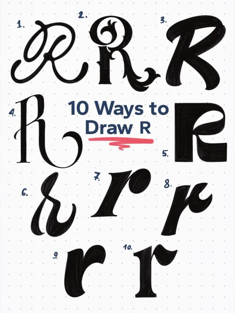
🔤 10 Ways to Draw the Letter R – Style Descriptions
1. Ink Loaded Monoline Script
What makes this letter look so cool is the ink overloaded effect. For the most part, the letter has an equal weight distributed, however, the endings are slightly thickened to give it a tapered and more dynamic look. Also the overlapping points are blended together giving it that “liquid” look.
2. Heavy Flourished Baroque Serif
This one wears its flourishes proudly. Inspired by 18th-century lettering, the decorative terminals and a curved leg make it feel theatrical—almost like it’s mid-curtsy. I really went heavy on the details here. Trying to push it to its limits. This could work well as a drop cap when working with more text—just an idea…
3. Retro Funk Sans
A bold, rounded R with soft corners and playful proportions. Inspired by the sign painter’s brush casual letterforms.
4. Tall Transitional Serif
Stately and refined. This serif R pulls from transitional typefaces with an elegant stem, moderate contrast, and a curved leg that adds just enough movement. Be mindful about adding big swashes when working with multiple letters and words. Readability is always a key element.
5. Bold Liquid Experimental
Strong, squared-off features give this letter weight. The “liquid” refers to the closed counter space that is shaped like a drop of water.
6. Swashy Brush Script
A lowercase r full of flair. The brush influence comes through in the entry stroke and swooping terminal—casual but still stylish.
7. Forward-Slant Flared Serif
This one almost leans into motion. Packed with a ball terminal and flared pointed serifs.
8. Italic Loop Script
The tight counter and connected loop suggest speed and style. It looks handwritten but refined—great for adding warmth in branding.
9. Blobby Casual Script
This lowercase r is all characters. With thick strokes, playful bounce, and no sharp edges, it feels friendly and hand-drawn.
10. High Contrast Ionic Serif
A bold take on the classic r. The ionic styled serifs are paired with a wing-shaped piece to create that distinctive lowercase r look.
Explore the full Hand Lettering Style Database →

Master Every Letter A–Z With 260 Creative Styles
The Style Your Alphabet Workbook is your hands-on guide to building confidence, creativity, and control in your lettering.
Inside, you’ll find:
✅ 260 hand-drawn letters to trace and remix
✅ 26 word examples to practice real-world design
✅ Beginner-friendly insights that teach you how to think like a lettering artist
About the author

Hey, I’m Max. I’ve been drawing and messing around with letters since 2011. I don’t have a formal art degree—my background is actually in the kitchen as a former chef and on the streets painting graffiti with my friends. Over the last decade, through a ton of trial and error, I somehow turned that obsession into a full-time gig. These days, I design custom logotypes for global brands and paint large-scale murals. I started Lettering Daily just to create the kind of honest, no-BS tutorials I wish I’d had when I was starting out. Stick around, and let’s draw some letters.
