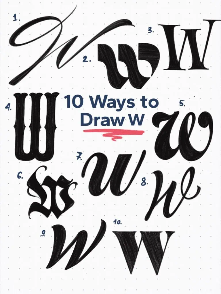
W is a letter of duality—two strokes, often mirrored, yet wildly open to interpretation. Whether tall and elegant, tightly looped, or wildly expressive, the W can bounce between structure and flair with ease. It’s a letter where rhythm matters. Balance the width, lean, and connection of its arms, and you’ll unlock a powerful sense of movement. Ready to explore all the ways this double-stroke wonder can shine?
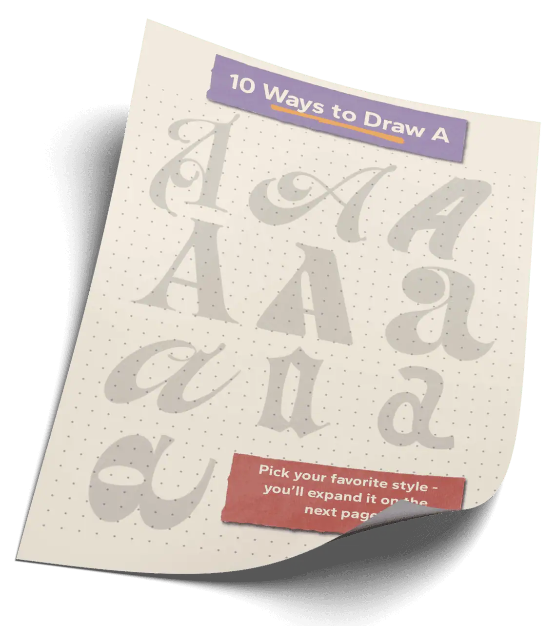
🎁 Free Lettering Worksheet Download!
Get one full tracing page straight from the Style Your Alphabet Workbook — absolutely free.
Practice, trace, and start styling your letters today!
🔤 10 Ways to Draw the Letter W – Style Descriptions
1. Expressive Flourished Script
This style channels motion and energy through full-arm strokes. It’s dramatic and sweeping—perfect for anyone with a love for brush calligraphy. Flourishes amplify the rhythm and give the letter a sense of dance.
2. Abstract, Geometrical Experimental
The W is a complex form, so I challenged myself to simplify it down to its essence. The result is bold, minimal, and intentionally weird—but in a good way. Think of it as the Bauhaus rebel of the bunch.
3. Transitional Serif Uppercase
A high-contrast, bracketed serif W drawn with a twist. Some of the proportions are exaggerated and playful, which gives it a slightly spooky, Halloween-esque personality while still feeling refined.
4. Condensed Tuscan Serif
No stroke contrast here, just character. With chunky stems and split-tipped Tuscan serifs, this condensed W delivers strong western vibes. The middle spurs are subtle but add the perfect dose of flair.
5. Ad Roman Italic
Playful and rhythmic. With smooth curves and gently looping forms, this italic W feels casual yet polished. Perfect for cheerful titles or expressive ad layouts.
6. Ornamental Fraktur W
Angular, dense, and dramatic. Inspired by blackletter traditions, this W is full of character—from its tight counters to its ornate spurs. It brings undeniable presence to any gothic or vintage design.
7. Italic Lowercase
This version is all about smooth transitions and graceful rhythm. The curved legs taper softly, giving the letter a sense of continuity—like it’s mid-stride.
8. Elegant Modern Script
Here’s a fun experiment: the first diagonal stroke ends sharp, the second ends soft. Both together create balance and contrast, giving the W a touch of duality—elegant but unexpected.
9. Bold Brush Script
Rhythmic and lively, this brush-style W keeps the strokes consistent and full-bodied. The thick vertex gives it momentum, while the brush-inspired texture adds an organic, handcrafted feel.
10. High Vertex Serif
It’s not necessarily tall, but it looks like it is. The sharp, raised vertex paired with high contrast strokes gives it that illusion of height. Bold, clean, and a little dramatic—just how I like it.
Explore the full Hand Lettering Style Database →
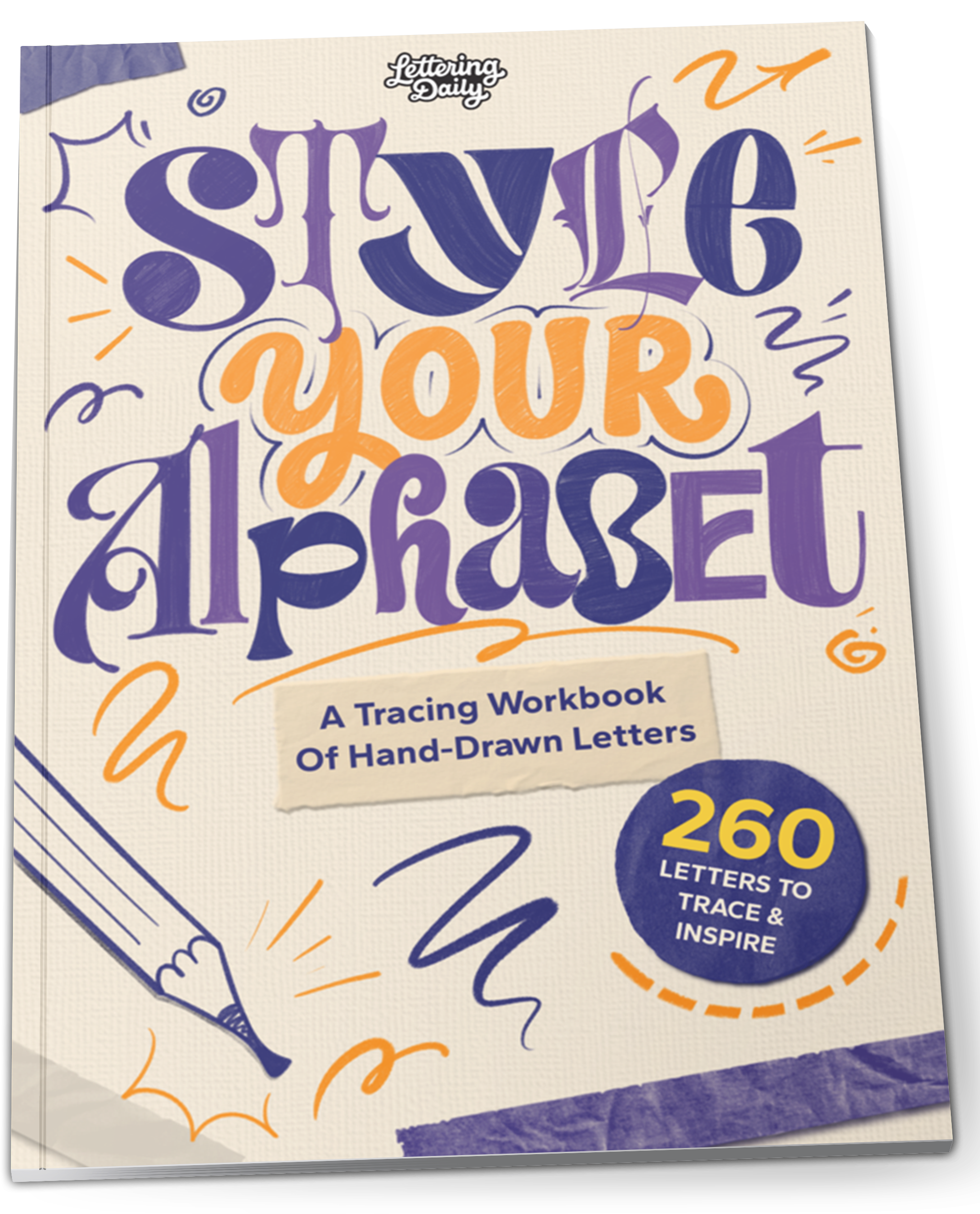
Master Every Letter A–Z With 260 Creative Styles
The Style Your Alphabet Workbook is your hands-on guide to building confidence, creativity, and control in your lettering.
Inside, you’ll find:
✅ 260 hand-drawn letters to trace and remix
✅ 26 word examples to practice real-world design
✅ Beginner-friendly insights that teach you how to think like a lettering artist
About the author

Hey, I’m Max Juric, and I’m deeply passionate about calligraphy and hand lettering.
I’ve spent years honing my skills in the art of lettering, working with hundreds of clients from all over the world on design projects such as logotypes, branding, custom lettering, murals, and more.
But my journey doesn’t end there. I’ve also dedicated myself to sharing my knowledge and expertise with others, creating a wealth of resources including tutorials, articles, and podcasts.
It’s been incredibly rewarding to see thousands of people engaging with my content each month. Knowing that I’m helping fellow enthusiasts grow and develop their skills makes me really happy.
Welcome to Lettering Daily, your hub for all things lettering and calligraphy. Whether you’re a seasoned pro or just starting out, I’m here to inspire and guide you on your lettering journey. Stick around, and let’s explore the world of letters together!
