Welcome back for another interview!
I had the honor to pick the brains of a true lettering legend – Ken Barber of House Industries.
Ken has been working as a lettering artist and type designer for well over 25 years.
Throughout his career, Ken has worked with some of the biggest names you can imagine, and he just published his new book – ”House Industries Lettering Manual”.
In this interview, Ken shares his story along with a ton of great insights, tips, resources, and more.
I hope you’ll enjoy this interview as much as I did!
1. For those who don’t know you, tell us about who you are and what do you do?
I’m Ken Barber, a professional letterer and typeface designer who has been working in the design field for over 25 years. In addition to creating logos and lettering at House Industries, I’m the creative studio’s typeface designer and type design director. I also teach at The Cooper Union school in New York City, and conduct lettering workshops worldwide. I’m coauthor of The Process Is the Inspiration with Andy Cruz and Rich Roat. My latest book is the House Industries Lettering Manual (links to Amazon), which was released on April 14, 2020.

2. How did you get into lettering, what kickstarted your journey?
I’ve had an interest in lettering and illustration since I was a kid. I spent a lot of time copying Don Martin comics from the pages of Mad magazine. I still enjoy his hand-lettered sound effects. Not only do they look cool, they sound hilarious: SKROINCH, GA-SHPLUCT, SPWATCH.
Later, When I got into skateboarding in my teens, my obsession turned to the artwork of Jim Phillips. As the art director for Santa Cruz skateboards, he drew most of the ads and deck graphics for the brand during the 1970s and 80s. His most famous piece is probably the “screaming hand” logo. I particularly liked the way that Phillips integrated lettering with his illustration. Rather than treating letterforms as separate elements, he saw them as opportunities to enhance his drawings. His work profoundly changed the way I viewed the alphabet and its potential as the subject for art itself.
While attending Tyler School of Art in Philadelphia in the early 1990s, I befriended Allen Mercer, a former House Industries partner. Sharing a similar fascination with illustration and lettering, Al encouraged me to combine my personal interests with my school assignments. Our friendship also made a significant impact on my attitude toward letterforms.
Although I was already producing fonts for House in college, I officially joined the crew in 1995 as an illustrator and letterer. Over the years, however, I gradually began focusing exclusively on typeface design and lettering.

3. What do you enjoy more between creating a typeface and logo work? Is it even something that we can compare?
The two disciplines are really rather different from one another, so it’s difficult to compare them. Logo work and hand-lettering is rewarding because projects are unique, each with varying demands. It’s also immensely gratifying to be able to complete a project in a relatively short period, as compared to the time it takes to develop a typeface. Depending on their scope, font projects can take months or even years to complete. The practice demands sensitivity to a broad spectrum of components comprising the design throughout all weights and styles, which is something that lettering doesn’t require. Unlike the forms in a logo which exist in a fixed predetermined context, the characters that make up a font must work in any conceivable combination. This takes planning and careful consideration in order to ensure that the final product produces a balanced visual texture and rhythm. Although it can be tedious at times, I enjoy watching a typeface gradually come to life.

4. What are some of the key ingredients in your creative process?
When I approach a lettering job I want to make sure that the piece I create embodies the spirit of the person, product, message, or brand that it represents. In order to do that successfully, it’s critical to be as informed as possible about all aspects of the subject. Good research ensures that a mark will have a strong conceptual grounding.
This usually informs the aesthetics of the lettering, how the forms look and behave. To produce a memorable mark, I attempt to introduce something distinctive in the letterforms or the composition that will set it apart. Fortunately, each piece of hand-lettering is different, so it’s important to explore the creative opportunities that every project presents.
While it’s a less exciting part of the creative process, making sure that a logo or wordmark meets practical demands is also essential. This depends on how the mark will be applied, and where it will ultimately appear. Am I drawing letters for a logo, or a poster? Each scenario has special requirements, which means that the stroke contrast, letter spacing, or proportions must be treated accordingly.
It boils down to developing sharp observational skills, which should be an ongoing endeavor. Incidentally, I find that these guidelines map well onto typeface design projects, too.

5. Whose work inspires you? Can you name a few artists/designers, and tell us why?
I’m influenced and inspired by so many contemporary artists, that I’m usually reluctant to list them for fear of forgetting someone. As a friend and mentor, Ed Benguiat has had an immeasurable impact on me both personally and professionally. The same goes for Ricardo Rousselot and the late Doyald Young. Tom Carnase, Tony DiSpigna, and Keith Morris are other letterers from the old guard whose lettering I admire. John Downer’s and Carl Rohr’s brush skills also never cease to amaze me. I tend to be drawn to work by artists who appear to have a similar mindset, probably because they strive toward the same level of refinement and artistry that I hope to achieve.
I appreciate the playfulness and inventiveness in the work of Ivan Castro, Alex Trochut, Ying Chang, Jeremy Friend, Kyle Letendre, Jed Chisholm, Kirill Richert, Mark Caneso and Vincent de Boer. I especially enjoy the script work of Sergey Shapiro, Antero Nuutinen, Gemma O’Brien, Mika Melvas, and Matthew Tapia, as well as the utter control and finesse demonstrated by Dave Smith, BJ Betts, Kevin Cantrell, Tobias Saul, and Martin Schmetzer.
Among type designers, I am inspired by the consideration that goes into the fonts of Erik van Blokland, Jonathan Hoefler, Kris Sowersby, Christian Schwartz, Tal Leming, Tobias Frere-Jones, Dave Foster, James Edmondson, and Maximiliano Sproviero.
I’m certain that I’ve missed loads of artists whose work continues to impress me, so please forgive me if I neglected to mention you!

6. You’re an internationally recognized lettering artist and type designer, you’ve worked with huge brands, taught at universities, spoke at conferences, you wrote books, etc. Is there anything else you would love to achieve? If so, what would that be?
I thoroughly enjoy doing all of those things, and hope to continue to do so. I’m truly grateful for all the opportunities that have presented themselves in the course of my career. It’s probably not a satisfying answer for readers, but I would be happy to continue to do what I’ve been doing: lettering, designing type, writing, and teaching.
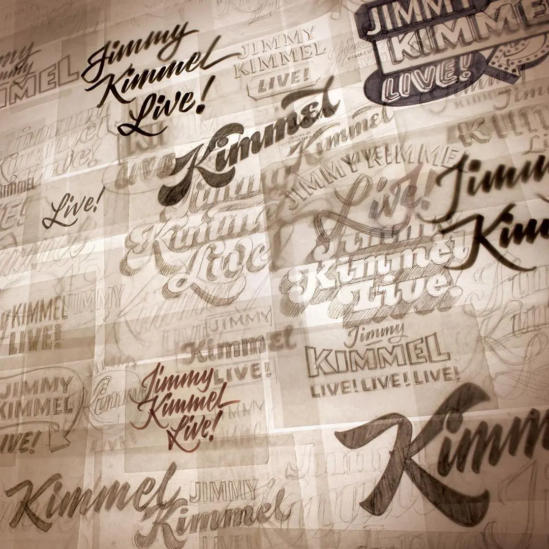
I’d love to take on more projects that have a physical or interactive component to them, like the sign lettering I designed with House Industries for Jimmy Kimmel’s Comedy Club in Las Vegas or the Suzanne Roberts Theatre in Philadelphia. Those sorts of jobs present stimulating challenges because of the additional factors to consider, like illumination and fabrication. Those elements force the letterer to approach the decision-making process a little differently, which is exciting to me.
There are still a few more books I’d like to write, but producing something like my new House Industries Lettering Manual is a demanding and intensive undertaking. So, projects like that will require more time to tackle.

7. Lettering was quite popular in the advertising industry throughout the 20th century. In your opinion, what sort of changes is the internet (and social media) era having on the lettering industry?
Although advertising letterers of the 20th century no doubt enjoyed what they did, work was seen primarily as a commercial endeavor. Sure, artists had pet projects or used their skills for personal work, but I get the impression that they didn’t necessarily draw letters for fun, as least not in the same way that many contemporary letterers do. Today, lettering is seen not only as a profession, but also as a legitimate hobby, similar to the way that calligraphy has been positioned. This has created a new and diverse audience, opening up different opportunities for letterers to share their skills. Obviously, the internet and digital media has made it possible for novices and hobbyists to access information easily, and for artists to reach large numbers of people.
These advances have also eroded the walls that separated different letter-making disciplines which had previously existed more or less independently. Calligraphers, sign painters, typeface designers, and commercial letterers traditionally occupied different spaces along the design landscape. These days, however, it’s not uncommon for an artist to create work for an ad campaign, paint a mural, and make fonts.
Whatever the future holds, my hope is that talented people will go on making quality letterforms, and that the demand for them will continue.

8. Where can someone learn more about the history of hand lettering? Can you recommend some books/resources?
If you want to learn about the history of Latin letterforms, I suggest reading The History and Technique of Lettering by Alexander Nesbitt. It’s not an instruction guide, per se, but the author does attempt to trace the beginnings of lettering in modern advertising. The book also documents parallel handwriting, typography, and lettering trends over the past few centuries, and includes a series of design exercises.
Mortimer Leach’s Letter Design in the Graphic Arts has recently been reprinted by Echo Point Books and Media. The classic text introduces the process of lettering by referring to typographic models, similar to the approach that I cover in my Lettering Manual. The author’s Lettering for Advertising gets further into process, but is out of print and unfortunately tougher to find.
Script Lettering for Artists, a Dover reprint of The Script Letter by Tommy Thompson, is a foundational text on the topic of contemporary script lettering by one of my favorite letterers of the 20th century. Thompson demonstrates the tools and methods used to create various script styles, and includes a short how-to section. The instruction isn’t extremely thorough, but it’s a must-have for any lettering library.
Fonts and Logos by Doyald Young offers a great overview of typographic styles and type terminology, and is loaded with examples from one of the most versatile letterers of the recent past. A former student and colleague of Mortimer Leach, Young details his lettering approach, from sketch phase to final vector artwork.
I also recommend The ABC of Custom Lettering by Ivan Castro. As far as I know, it’s is one of few recent publications that connects the principles of writing and lettering in one comprehensive instruction manual. (And, no, I don’t get any kickbacks from sales because I wrote the foreword.)

9. From your experience, what are some of the common mistakes beginners tend to make when they are trying to learn the art of lettering? In other words, what do you think beginners should focus mostly on?
One of the biggest misunderstandings that I see is the tendency for beginners to think that different letterforms should occupy the same space or that their common components should behave exactly the same way. You often see novices assigning the same proportions to all letters, despite the different demands that each requires. An H and an O might appear to have similar dimensions, but usually the O will need to need to be slightly wider and taller. This is because to our eye elliptical forms appear to have less volume compared to rectangular shapes of the same mechanical measurements. Adjustments have to be made so the forms appear optically comparable. Ultimately, it’s critical to remember that all letters have at least some differences between them which will mean that each needs to be treated individually.
The same goes for shared components between letters. An A and H may both have a center crossbar, but that doesn’t mean the horizontal strokes should be positioned at the same height. In conventional designs, the diagonal strokes of the A meet at an acute angle, which greatly reduces the negative space in the top of the form. In order to balance that area with the space below it, the crossbar will be lower than one in a corresponding H.
These are just two examples that illustrate the importance of balancing color, or even visual texture, which should be the primary goal of the letterer. That’s why I stress the development of observational skills to beginners. Technique is not a purely mechanical process. Good lettering relies on optical ability, as much as it does draftsmanship.

10. Do you need to go to design school to become a lettering artist? Are there any other resources that could serve as an alternative, and if so, what would your recommendation be?
I attended art school, but my area of study was graphic design. I’m largely self taught, but did learn much from other artists who had already established themselves. I picked up what I could from people like Ed Benguiat, Doyald Young, John Downer, and Carl Rohrs, and filtered what I learned through my own perspective. This was at a time when desktop publishing was taking off in the 1990s, and people momentarily turned away from traditional methods like hand-lettering. Today’s students have many more resources available to them, like lettering conferences such as Typographics and LetterWest, and in-person workshops like the ones I teach. While there are also loads of online classes, and guidebooks like my new Lettering Manual, it’s hard to replace good ol’ one-on-one instruction.
11. Tell us about your new book, the “House Industries Lettering Manual.” How is it different from the previous one – “House Industries: The Process Is the Inspiration“?
The Process is the Inspiration offers simple guidelines that form the basis of the House Industries’ creative approach. They’re fairly basic principles, like “Make Friends” and “Get Your Hands Dirty.” But the theme of the book is best summarized by a piece of lettering at the conclusion of the text: “Learn from what you like, and apply it to what you do.” Everyone’s individual approach comes from combining personal influences —like experiences, preferences, and talents—in a meaningful and effective way. Real inspiration is born from the roots of the creative process itself.
The new House Industries Lettering Manual (links to Amazon), on the other hand, is an instruction guide for drawing successful hand-lettering. I draw on my 25+ years of experience, sharing with readers loads tips, tricks, and techniques that I use in my own work. I cover typographic terms, various drawing tools, methods for drawing and composing lettering, and digital production techniques. For more advanced letterers, I discuss more subtle concepts, like creating tension in lettering and utilizing visual effects to get the most out of your work. There are also a bunch of case studies to see how these ideas are put into action, and handy skill-building exercises for readers to try it themselves.

12. Finally, is there a lettering skill/technique that you would like to learn and implement in your work?
With the exception of brush work, most of the letters that I make are drawn, as opposed to written. With that in mind, I’d like to make more time to practice broad-edge pen calligraphy, especially chancery and blackletter styles. I’d also like to explore pointed pen writing, another method with which I have limited experience.
I’d also like to implement more concepts in my process that I often find in unexpected and surprising places. For example, the protagonist of a novel I’m currently reading describes historians as concerned less with the “when” of past events, but rather with the “what” and the “how.” Once a person’s understanding is liberated from the constraints of time —what something traditionally has been and presumably “should” be— it allows one to combine and apply thoughts more freely. As a letterer working with concepts, techniques, and models entrenched in history, notions like this give me encouragement to pursue and blend disparate ideas that I might not have thought to do otherwise. I’m probably over-intellectualizing it, but at least I feel validated in trying off-the-wall stuff!

Thank you for stopping by and reading this interview.
If you have any questions or comments, be sure to drop them below.
You can grab Ken’s freshly published book by clicking here – ”House Industries Lettering Manual”. The link leads to Amazon.
Check out Ken’s other platforms at –
About the author

Hey, I’m Max Juric, and I’m deeply passionate about calligraphy and hand lettering.
I’ve spent years honing my skills in the art of lettering, working with hundreds of clients from all over the world on design projects such as logotypes, branding, custom lettering, murals, and more.
But my journey doesn’t end there. I’ve also dedicated myself to sharing my knowledge and expertise with others, creating a wealth of resources including tutorials, articles, and podcasts.
It’s been incredibly rewarding to see thousands of people engaging with my content each month. Knowing that I’m helping fellow enthusiasts grow and develop their skills makes me really happy.
Welcome to Lettering Daily, your hub for all things lettering and calligraphy. Whether you’re a seasoned pro or just starting out, I’m here to inspire and guide you on your lettering journey. Stick around, and let’s explore the world of letters together!


This interview contains a lot of important resources that any aspiring lettering artist should take time to study. Thanks for this! I am excited to get a copy of the book.
Thank you Regie! I am happy to hear that you enjoyed this interview 🙂 I also look forward to reading Ken’s new book!