
This post and the photos within it may contain affiliate links. If you purchase something through the link, I may receive a commission at no extra charge to you.
Do you want to learn how to add shadows to your lettering?
You’ve come to the right place.
Hey, creative people!
I’m RK Sanchez, also known as Skribsinner on social media. I am a self-taught lettering and modern calligraphy artist from the Philippines.
I started my modern calligraphy journey in May 2016 and since then, I haven’t left a single day without creating anything with my pens, trying to be better than my “yesterday” self.
With the help of constant practice, along with all the bloody experiments and frustrations (lol), I am here to teach you the basics of shadowing and the techniques that I discovered (but not invented) over my two-year journey.
Here are the things that you will learn after reading this article:
- What are shadows and why do we put them on letters?
- The source of light
- The 5 types of shadowing
Also:
We are going to have some step-by-step instructions so it’s better to have your writing materials ready, such as brush pens/markers and paper, throughout this article.
Here are the usual materials that I use:
- Brush pens: Artline Stix, Sakura Koi, Tombow ABT, Faber Castell
- Fine Tip brush pen: Tombow Fudenosuke Soft Tip or Pilot Petit 3
- Light gray brush pen: Zig Clean Color Real Brush No. 091 (light gray) or Sakura Koi Coloring Brush Pen No. 153 (light cool gray)
- Drawing pen for outlines: UniPin, Sakura Micron
- Pencil: Pentel GraphGear 500 (PG515) 0.5mm
- Paper: 200-250gsm vellum board
But of course, you can use the materials that you are most comfortable with.
Let’s get started!
What are shadows and why do we put them on letters?
Before explaining anything, let’s check these two figures out:

They are the same word written by the same person, using the same strokes.
But there is a big difference between the two: The first figure looks good but plain and flat, whereas the second one seems to be more realistic with its 3D effect.
This funky 3D look of the second figure is made possible with the help of shadows.

Shadows are basically the area where the light can barely enter or cannot enter at all.
Try to look at all the stuff around you right now and imagine they only had one pigment just like the first figure. Isn’t it dull and unrealistic?
This is why we apply shadows to letters.
Shadows make our letters come to life. They make them more appealing and stay connected with the viewer, and this is because they look realistic, just as real as the things around you right now.
Disclaimer:
I don’t want you to think that shadows are all we need to make our lettering piece look good.
Of course, other aspects such as the letter forms, kerning, etc. are important. It also doesn’t make you a bad lettering artist if you don’t apply shadows to your letters.
Shadowing is just a technique that we do because we want to do it. It’s the artist’s choice and style.
The good news is we don’t need some mathematical formulas for us to understand shadowing in letters.
Unlike in other mediums and forms of visual art, the shadowing techniques that I’m going to teach you are easier to understand and apply.
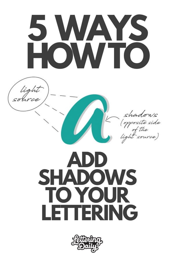
The source of light
Shadows cannot exist without light. Where there is light, there are shadows.
This is why it is necessary for us to know where the source of light is when shadowing.
This is the first thing that you should decide before putting the shadows.
And yes, you saw it right. It’s you who decide where the light source should be.
The basic rule:
The shadows should appear on the opposite side of the light source.

- If your light source is on the left side, the shadows should appear on the right of the letters.
- If your light source is on the right side, the shadows should appear on the left of the letters.
The same thing when your light source is above the letters, your shadows should be beneath the letters.
If you’re familiar with my work, I mostly use the same light source which is on the upper left hand (around 10 o’clock) of my pieces. Hence, my shadows appear on the lower right (around 4 o’clock) of the letters.

Remember:
Consistency is the key to have a successful 3D illusion for your lettering piece.
You can decide to put the light source on the left for something you do today, and put it on the right side for another piece tomorrow.
But where you put the source of light doesn’t really matter, as long as you consistently put the shadows on the same side all throughout the piece you’re working on.
The 5 types of shadowing
Enough for all those technicalities! We finally arrived here and we’re all set for you to learn how to put the shadows. Here are the 5 shadowing techniques that I commonly use.

3.1 Basic Shadow
Just like what the name says, this is the most basic shadow you can put on your letters. This is great for those who have never tried shadowing before!
You can apply it either on the left or the right side, depending on where the light source is.
Let’s try this having the source of light on the left.
What you need:
- Brush pens and paper
- A light gray brush pen/marker
- A pencil
Step 1:
Draw/write a word like how you normally do. Any color would do.

Step 2:
Determine where to put the shadows. You can use a pencil to mark where the shadows should appear.
(It’s okay to disregard this step once you get used to where the light source and the shadows should be placed.)

Step 3:
Apply the shadows using the light gray brush pen/marker.

Optional:
Erase the pencil marks if they are too obvious. This will make the shadows look neater.
Reminder:
Don’t forget to apply shadows inside the letters and on thin strokes, too! This is something that most beginners tend to miss.

3.2 Dark Shadow + Basic Shadow
Now, let’s double the fun and add a darker shadow, which results to a stunning 3D effect.

What you need:
- Brush pens and paper
- A black fine tip brush pen/marker (I usually use Tombow Fudenosuke Soft Tip or Pilot Petit 3. These are brush pens so the width of the shadow will be consistent using a single stroke)
- A light gray brush pen/marker
- A pencil
Step 1:
Draw/write a word like how you normally do.

Step 2:
Mark where to put the shadows using a pencil.

Step 3: Apply the shadows carefully using the black fine-tip brush pen/marker.

Tip:
Leave the black ink and let it totally dry for a couple of minutes. It could spare us from the nightmare of seeing it bleed or smudging it when applying the lighter shadows. (But it could be a good effect for Halloween, lol)
Optional: Erase the pencil marks if there are still any. Do this only when you’re sure that the black ink has totally dried.
Step 4: Add another layer of shadows right next to the dark shadows using the light gray brush pen/marker.

Looks fun, right? 😀
3.3 Overlapping Shadow
I use this in monochromatic (means using only one color) lettering pieces.
The shadows create an illusion that some parts are on top of the others.
You also need to imagine that the source of light comes from the viewer’s eyes.
So the shadows should appear on the parts that are NOT on top.

What you need:
- A set of brush pens (at least three) with the same color family (at least 1 light, 1 medium and 1 dark). For example: green, light green, dark green
You may also use colors in analogous harmony. For example: orange, vermilion, red
- A pencil
- At least 200gsm paper (we don’t want to ruin the work with a thin piece of paper because we’re going to apply layers of ink)
Colors that I’ll use:
- Base: Orange(Sakura Koi)
- Medium: Vermilion (Sakura Koi)
- Dark: Red (Sakura Koi)
Step 1:
Write a word using the base color.
The base color is the lightest shade of color you have among your set of pens.
So if you have red, orange, vermilion, you must use orange as your base color.

Step 2:
Decide which parts should be on top. Mark them using a pencil as a guide.

Step 3:
Apply the colors on the shadow area starting from the darkest.
We need to blend the colors carefully. The darkest should blend with the medium one and do it until you reach the base color.
In our example, apply red starting from the pencil guide.
Then gradually going farther from the pencil guide, next is vermilion, which should blend with red, and lastly orange, which should blend with vermilion.


Tip:
You can use a little of black or brown as the darkest shade, except when working with neon colors like yellow, apple green, etc.
I added a little brown (Sakura Koi) here:

Now, we can see that some parts overlap the others. 😀
3.4. Ribbon Style

This may be a little more difficult than the others at first, but when you finally get the knack of it, it will be super fun and addictive.
Here’s the thing:
You have to understand how real ribbons are spiraled and how the curves produce shadows.
When ribbons are spiraled, they look like this:

And there we can see that the “back” of the spiral ribbon produces shadows.

Now, we will combine this concept with the concept of thick and thin strokes of calligraphy to create the ribbon illusion.
To sum it up:
The thick/down strokes will be the “front” of the ribbon, and the thin/up strokes will be the “back”.
What you need:
- The same materials we use for Overlapping Shadows
Colors that I’ll use:
- Base: Fresh Green (Sakura Koi)
- Medium: Yellow Green (Sakura Koi) and Yellow Green (Artline Stix; this is a little darker than Sakura Koi)
- Dark: Green (Sakura Koi)
Step 1:
Write a word using the base color.

Tip:
The back and front of spiral ribbons have the same width. Hence, when doing the ribbon style, try writing the up and down strokes using similar or the same width. This will make the ribbon illusion more successful.
Step 2:
Using a pencil, mark all those twists and transition sections between letters.

Step 3:
Put the shadows on the up strokes. Apply the darkest color starting at the pencil guide. Blend the darkest with the medium shade and lastly, blend the medium with the base color (just like what we did in Overlapping Shadow).

Tip:
Notice the letter ‘C’. Don’t you think this ribbon looks thin?

Notice the letter ‘E’. Don’t you think this ribbon looks thick?

The farther the shadow area from the curve is, the thicker your ribbon will appear.
3.5. Cutting Shadow

I mostly use this technique in digitized lettering but this is also great in analogue ones!
Here, we “cut” some spaces from the letters, to form an illusion of shadows, instead of normally applying them.
This also creates an illusion that some parts are on top of others.

What you need:
- Your usual writing tools
- A pencil
- Any black drawing pen (fine liner) for outlines
- Any black marker/brush pen
Step 1:
Write a word like how you normally do.

Step 2:
Using a drawing pen, trace the outline of each letter.

Step 3:
Make another layer of outlines, but make them thicker this time.

Step 4:
Fill in the white spaces between and inside the letters with your black marker.

Step 5:
Using a pencil, determine where to put the cutting shadow.
Remember:
Put them on parts that you want to look on top. They are usually found in intersecting parts of letters.

Step 6:
Fill in the cutting shadow using a drawing pen.

BONUS: Drop Shadow
Basically speaking, when a light is blocked by a thing and that thing is a little far from a surface, a drop shadow can be formed on the surface.
Drop shadow is a common technique that is also great for beginners. So here’s the easy trick that I discovered in making drop shadows that have the exact same size as your letters.
What you need:
- A black brush pen/marker
- A colored brush pen/marker
- Thin sheets of paper (below 100gsm)
- A pencil
- Cotton balls or cotton swabs
Step 1: Write a word using a black marker.

Step 2:
Place the paper where you wrote the word under a new thin sheet of paper. Trace the word using a colored pen.

Step 3:
Move the paper with the colored word sideward and/or downward, depending where you want to put the drop shadow. Then trace the outline of the word using a pencil.

Step 4:
Shade the inside of the shadow using your pencil.

Step 5:
The shadow looks sloppy at the moment. So using a cotton ball or swab, smudge it until it’s smooth.

… and voila! You’ve got an awesome and neat drop shadow.
General Tip:
If you don’t have a light gray pen, you can always use a pencil! It’s a great alternative. Just like what we did in the drop shadow technique.
Final words
And there you have it friends!
5 different methods on how to apply shadows to your lettering.
The best way to learn how to apply shadows is to try out all of them.
Huge thanks to @skribsinner for taking the time to share her knowledge on this topic.
Now we want to hear from you, which shading method is your favorite?
Be sure to drop a comment below.
Until the next one,
Stay AWESOME!

Stay updated with my tutorials and get instant access to the Lettering Crate –
A growing library of free lettering & calligraphy resources that includes –
Pin me!
About the author

RK is a self-taught visual artist from the Philippines. She started being interested in art at a young age of six.
Since then, she has explored different kinds of medium, such as oil and acrylic paints, oil pastels, colored pencils, charcoal pencils, watercolor, and hand lettering using ballpoint pens.
In 2016, she came across modern calligraphy and until now, her focus of improvement has been into letters. She has conducted several modern calligraphy and hand lettering demos for products and artist groups in the
Philippines. RK’s works have been featured in numerous art and lettering sharing communities, and also
used in covers of some books. She is now exploring her skills in digital designing and has created logos
and designs for companies and individuals.
Thank you for making this tutorial. It was clear and easy to understand and very helpful
Thank you! 🙂
It’s 2021, and this post is still helping people like me!
My shadowing looks great in my head, but when it gets to my hands is when the chaos starts.
But, now I finally have a beautiful brush stroke letter ‘B’, with a gorgeous shadow, (and one with a ‘eeehhhh’ shadow). None of the hand lettering tutorials ever worked as much as seeing your word ‘Basic’ – something just clicked! The rest of my name needs a little work, but I have a page full of beautiful, red Bs with light grey shadows.
I’m going to go look at everything else here now! Thank you for all the time and effort you’ve put into this. You’re making the world a prettier place.
Super happy to read your comment, Becky!
If you are still struggling feel free to join the Facebook support group I run. Over there you can get constructive feedback and other helpful tips to help you learn and further improve your skills.
I have just come across this post. Thank you for taking the time to explain this shadow technique in so much detail. I have saved it and am going to use it a lot! Once again, top post!
Super happy to hear that 🙂
This was great! Easy to follow and understand 🙂 thank you
Thank you! Glad to hear that 🙂
Thank you so much. I will join Facebook group
You are welcome, Bridget. Please do 🙂
Best shadow tutorial so far. It has so many techniques with so much details. But at the end of the day, it’s all about the talent. Calligraphy has been my hobby for quite a while but I can say it isn’t a thing I can excel. I can make “ok” pieces but I lack creativity. Nevertheless, thank you for this, I will try this when I have time.
Thank you for your comment Rodyard! I really appreciate it 🙂 I think that talent isn’t something you are born with, but rather something you develop through life with proper and consistent practice. Creativity can sometimes be tricky and not consistent, however, i would be happy to help you out. Are you on Facebook? You should consider joining our official Facebook group where we constantly give feedback and help out people to learn, improve and push their skills to the next level.
The article is described with so much details and to the point content..
I love the way how shadow makes lettering so attractive…?
Makes me really happy to hear that you liked it!
Haven’t read an article / tutorial in such detail in along time. Thanks for making it interesting
You are very welcome! Im really happy to hear that you found this tutorial to be valuable 🙂
thank you very much now am on line
Hello, I want to thank you, RK Sanchez, for your interesting content, That’s it Thanks.
Amazing to learn this from the step-by-step tutorials. Thanks for sharing.??♀️from Holland.
You are very welcome! 🙂
I’m from the same countryyy, this is very helpful!!!! Can you please teach that kind of style of the letters, it’s so cool!!! Please reply:>
Wow, you really go above and beyond with your information! This is not just a simple experience but you took the time to give so many examples and in depth. You are a true find. Thank you ! I can’t wait to put these to paper.
Thank Lisa! RK really did an amazing job. We wanted to create a tutorial that anyone could easily follow, and im glad we managed to achieve that 😀
Thank you For sharing this techniques RK and Lettering Daily ???
Hey Sally!
You are so welcome! Be sure to share some of your work on the forum or on Instagram 🙂
Hiii Lettering Daily! I’m so glad you post this up. This is very beneficial and encouraging for beginners especially! I love your positive vibes and care to share information and knowledge! Thank you for your dedication and effort! Followed your instagram indeed!! Your works are very much appreciated. I look forward to more lessons and tips hehe!❤❤❤?
Hey Natilya!
Thank you, im really glad you are enjoying the content. Definitely check out RK’s profile for more inspiration as she is the one responsible for this awesome tutorial 🙂
Cheers!
This was really informative. I would have loved to watch you blend with the overlapping shadow.
Thank you! be sure to give it a try and tag us on social media posts, we would love to follow people’s progress 🙂
WOW!
thankyou for this super “how to”
can’t wait to start trying all the different styles you have in this demo
what a great email to open up the first thing in the am
Hey Linda! Thank you for the kind words 🙂
Glad you enjoyed the tutorial 😀
This is fantastic. I love your work. Thank you for the time and effort you taken to write this lesson. I haven’t read it all yet, but I will and I can see it’s going to be really helpful for me. Nicky from @nickys_ink
You are welcome Nicky! Take your time, the article will always be here 🙂
Great examples! Shadows make all the difference. Keep up the great work!
Kristin
Thank you Kristin!! We are so happy that you liked this tutorial! Cheers 🙂